
I found myself with an hour to spare in the university library recently. On the shelf in the good health section, I came across a book titled “Color Healing Manual” by Pauline Wills (1993). As someone previously trained in design, I quite liked the idea of healing chronic pain with color. It was a pretty big book, and whilst I don’t tend to write long posts (to save my pain-brain and yours too much trouble), there was so much that I wanted to include, so today you’re in for a long read (sorry).
First up was a short explanation of how our relationship with color is used (exploited?) in the fields of marketing and advertising. Something as simple as packaging dairy products such as milk, for example, is always orchestrated to use colors of white and blue (which imply cool, fresh, hygiene), whereas green would never be used (because it hints at mold). The relationship between color and the length of light’s wavelengths was discussed, and a brief history of color theory included. Ancient Egyptians apparently had healing rooms painted in different colors with openings that let light in at certain times of the day which exaggerated a particular color, so they had maximum healing impact. Ancient India has always believed our chakras radiate different colors, and their Ayurvedic medicine apparently relies on different gems and crystals for different effects due to their color. In Europe, Medieval doctors assigned colors to our different ‘humors’.
In 1851 the German Jakob Lorber published a book titled “The Healing Power of Sunlight” and healing with light and color took on a new twist that continues today. In the 1960s-70s jaundiced newborn babies, for example, were put under special lamps to reverse their condition and in the 1990s UV light began being used to treat skin conditions such as psoriasis (but by the 2000s, the link between UV and skin cancer was becoming obvious).
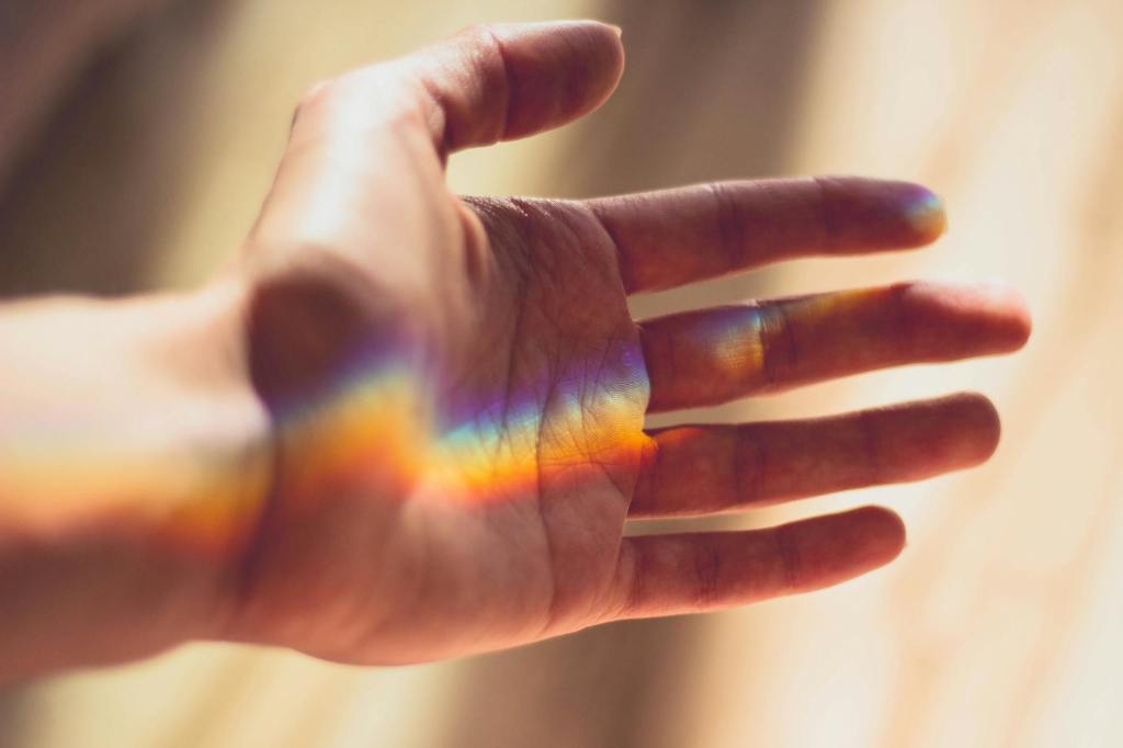
One of my favorite parts of the book was where the author went through the rainbow, as it were, and wrote about the effects certain colors (supposedly) have on our bodies.
Red, for example, which has the longest wavelength and lies closest to the infared end of the light spectrum, is warm, exciting, stimulating, and ‘loud’, and as such, tends to be associated with love, passion, blood, heat. It is apparently considered a ‘masculine’ colour. Visually it makes spaces smaller and as such is not good for people with asthma, hypertension, epilepsy or high blood pressure. On the flip side, it is good for increasing circulation and activating the adrenal glands.
Orange, is autumnal, earthy, and warm without red’s full-on heat. It tends to be related to ‘fruitfulness’ and therefore the reproductive organs. It supposedly has a more ‘feminine’ energy and is good for lifting depression and reducing muscle cramps.
Yellow is related to gold and powdered herbs (presumably turmeric etc.) It supposedly increases metabolism and stimulates nerves. Too much yellow can lead to mental detachment and cowardice.
Green, is midway along the spectrum, and is therefore associated with balance. It is considered restful, fertile, nourishing, good for the nerves. However, too much green has negative connotations related to poison, nausea and jealousy.
Blue is the first color which moves into the ‘cool’ end of the spectrum. It is associated with the sky, heaven, divinities, and therefore relaxation, meditation, peace, spirituality. It makes rooms look bigger and therefore is expansive, assisting people with asthma ‘open up’, as well as helping those with insomnia, stress and tension.
Indigo has been called ‘the vault of heaven’ and relates to dignity and aspirations. It can help those with mental complaints, and is associated with the brow chakra and infinite space. Too much indigo can lead to solitude and isolation.
Violet is the shortest wavelength, closest to the UV end of the light spectrum. Its royal associations tend to make it a regal, even wealthy color, that can help improve self-respect and dignity. It is also apparently a combination of red (male) and blue (female) and therefore balances energies. [Although the contemporary West might reverse those color assignments?]
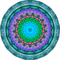
[I recently wrote about the healing-mandala that I made. When I look at it now, it’s interesting to see that main colors are ‘cool’ and associated with the brow; blue, indigo and violet, and all associated with expansive rest, peace, spirituality, meditation, and dignity, with a bit of green for nourishing balance. It also occurred to me, that the anacronym for the rainbow that I learnt as a kid (“Roger Of York Gave Battle In Vain”), is represented here by the GBIV end of the rainbow, which equals “gave battle in vain”… I’m going to pretend that this is endorsing the ‘make peace not war’ with your pain idea I wrote about recently. If you made a healing-mandala for yourself, it might be interesting to go back and see what your chosen colours mean… or else, what you’ve filled your home or wardrobe with.]
The book then went into auras, and I got a bit lost and non-committal, but I DO love the idea of generating your own mental-aura around yourself while you’re feeling unwell. In the past I have done meditations that encourage you to shroud yourself with white light, but I’m thinking I might try giving myself a halo of sky blue, or a cloak of violet light across my neck and shoulders when they seize up during migraine.
There was a complicated section on how to use color to heal, properly, but I’m going to adapt it to wearing colors that I think might help. I have a lot of navy blue, burgundy and dark green in my wardrobe, which probably suits my healing needs, but I do also have an orange tshirt and a yellow sarong. Call me crazy, but I’m tempted to wear them when I need a pick me up. I think I have a cherry-red scarf somewhere at the back of my cupboard which I might pull out when I really need an energy-boost.
Another section listed complimentary colors to cure certain ailments. I couldn’t possibly record them all, but some of the symptoms that come with migraine and their curing colors include: migraine / insomnia / sore shoulders (indigo & gold), stiff neck (blue & orange), eyestrain (all indigo), nausea (yellow & violet).
In terms of healing ailments, the book implied the symptoms are often quite literal. Sore eye? What don’t you want to see in your life? Stiff neck? You could be being dogmatic and refusing to look around, subconsciously maintaining a narrow point of view. Frozen shoulder? What burden won’t you put down? You need to open up and try to be a more authentic version of yourself.
What about headaches? The author suggests they potentially manifest a “desire to disconnect ourselves from the rest of our body or from our spirituality” (page 101). “Metaphysically,” the author goes on, “headaches are caused through a mind that is overburdened with thoughts and feelings which cannot be expressed because of fear and through the pressures of work, relationships and family life […] try looking rationally at your fears and the pressures that exist in your life. Unburden your mind by expressing what you are thinking” (page 102).
There were lessons on how to create a color cloak for protection, clearing negativity through color, and cutting the ties that bind. I quite liked the idea of mentally channeling color through your fingertips as you touch your temple, brow or eyes, or your hands are cupped over your eyes – perhaps while doing your EFT tapping. I also think I might use more color in my breath work; perhaps gold in as it radiates warmth through my body, and indigo out as impurities are blown away and dignity restored.
As with all such books, I’m becoming something of an eclectic bowerbird – I’ll take what I like and refashion it to suit! Sorry sages, sorry ancient wisdom, sorry wise women… I’m going rogue!!!
Take care taking care (colorfully), Linda x

Leave a comment